Film Poster Deconstruction - Lost in Translation
Posted by Matthew Leigh | Posted in Planning and Research | Posted on
0

'Lost in Translation' is a 2003 drama/comedy film written and directed by Sophia Coppola. It won numerous awards, and it's realistic comedy combined with it's sense of thoughtfulness in direction and warm, high contrast visuals are elements which I will be using in my own film. 'Lost in Translation' also contains realistic, 'normal' characters in an unusual situation, a key theme in my own film.
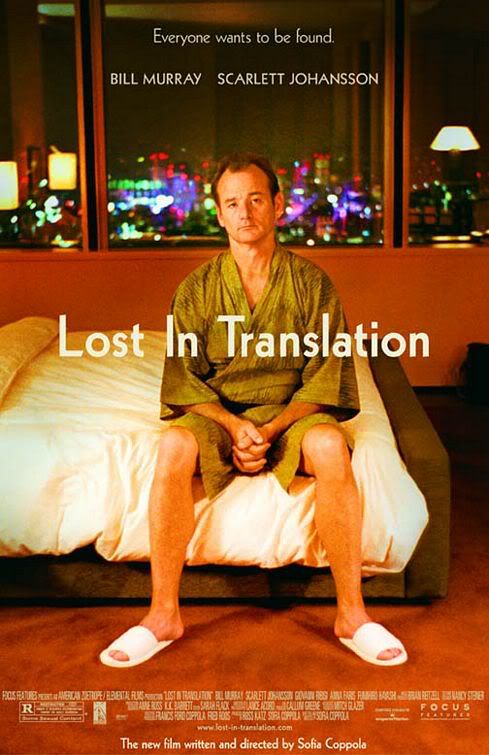
The poster for 'Lost in Translation' maintains the clean, warm aesthetic of the film, with a brownish tint and a high contrast ratio. The poster simply shows a large picture of Bill Murray (as main character 'Bob Harris') sitting on the end of a bed with his hands clasped together. The fact that he has his hands clasped together, along with the bemused look on the characters face as he gazes vaguely into the camera betray a sense of discomfort or unrest, as if the character is unsure exactly what to do with himself. We also see that he is sat in a bland, clear room, but with a bright large city behind him. This creates a potent sense of isolation; the warm, clean hues of the room contrasting heavily with the bright neon lights of the cityscape in the background. When these elements are combined with the simple title, 'Lost in Translation', which is displayed prominently at the center of the screen in a straight, white font, it is easy to understand that the character feels lost and isolated, presumably in a foreign city. This evokes an emotional response, even before any real details of the film are revealed. The need of emotional understanding and sympathy shows the target audience to be a mature one, most likely over 16 and mostly female.
The themes of emotion are further accentuated by the films tagline, displayed at the very top of the poster, reading 'everybody wants to be found'. This, once again, will evoke an emotional response from viewers, and will attract the target audience to the film. Directly under the tagline, in the same clean font but slightly larger are the names of the two lead actors. This will attract fans of both the lead actors, and broaden the target audience, especially considering Bill Murray's film history being more catered to a male audience, with films such as 'Ghostbusters'. The larger font shows the actors to be a main draw to the film. Interestingly, the next largest name displayed on the poster is at the very bottom, and is that of the writer/director Sophia Coppola. This will mean that the poster will appeal to Sophia Coppola's work, but also shows that her name is perhaps not as a big marketing draw as the star actors.
Much like nearly all other movie posters, the bulk of the film credits are in a tiny font near the very bottom of the page, showing them to be mostly unimportant in terms of marketing strategy.
