Treament
Posted by Matthew Leigh | Posted in Planning and Research | Posted on
0
Total Film's construction of the review of 'Biutiful' is similar to the review of the same film by Empire magazine in many ways, but also maintains many differences. Firstly, the review takes up a full page, allowing a more in depth review and a few more features on the page (which I will explore in more detail later).
The review features a large screen shot from the film taking up the whole of the top half of the page, immediately drawing a readers attention, and clearly displaying the key actors. The next largest detail on the page is the title of the film, printed in a large bold font and cutting into the bottom left hand side of the picture. This effectively causes the reader to look at the title when they are looking at the picture, as they partly take up the same space.
Interestingly, Total Film places the star rating (out of five stars) at the top of the article, just below the film title. This means that readers can get a brief impression of the positivity or negativity of the review before they even read it, in fact they are actively invited to do so. Directly to the right of the star rating is the release date, followed by a tag line for the review. This means that the important details are very clear and separated from the bulk of the review, but also, as the review's tag line is in the same area, the readers' interests will be piqued, and they will likely read the review anyway.
Similarly to Empire, the review ends with a summarised verdict of the film, once again giving those who merely want a brief impression exactly that, without having to trawl through an entire review. This Verdict is in a bolder, slightly lighter and larger font than the bulk of the review, and the subtitle 'The Verdict' is in a bright red font. This clearly separates it from the main review, and makes it easy for readers to find.
Interestingly, while Empire displayed details such as age certificate, director, lead actors, distributor and running time at the beginning of their review, Total Film places these at the very end, after even the summarised verdict. While the subtitles for these details are in bold, the font is actually smaller than the review and they are bunched together without line breaks. This shows that the magazine perhaps deemed these details unimportant in marketing terms, as they don't pique a reader's interest.
A few extra features are visible on the page. The first of these is a long thin box printed down the extreme right side of the image that takes up the top half of the page. The box contains text detailing films that are similar to the film being reviewed, stating 'see this if you liked...'. This is an effective way of getting readers who have seen the films detailed in this box, but are perhaps not aware of the film that is reviewed, interested in both the film and the review.
Another feature is the inclusion of a chart placed at the bottom left of the page, tracking the reviewers interest throughout the films running time, with labels on the high and low points of interest hinting at events in the film. The chart is quite large, and due to it's red colouring is quite prominent on the page. It is yet another device for giving the reader a general idea of the positivity of the review, with the reader barely having to read anything.
The language of the review is largely kept simple, much like Empire. However, there are a few examples of slightly more difficult language, such as, 'Biutiful, though, is ferocious filmmaking, directed with lyrical austerity and played with conviction.'
This hints that the review is directed more towards an adult reader, this being further supported by a few examples of mature language in the review, such as 'bitch'. The line also provides an example of alliteration, showing the review to be tailored to read smoothly.
1. What age category do you fall into? 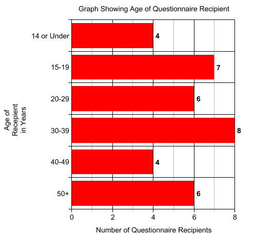
The chart clearly shows that I have a good age spread to draw data from, which will help me see what aspects of films have wide appeal.
2. Would you consider yourself a fan of the film medium?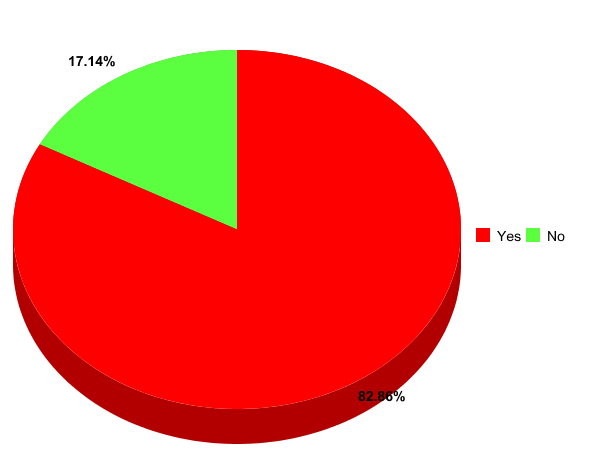
A large portion of people asked like films, who would obviously be the target for my own film. Having film fans answer my questions causes the answers they give to my other questions to have increased validity.
3. Do you enjoy short films when they are aired before features in cinemas (for example the Pixar shorts)?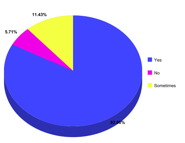
Once again, a large amount of my research pool enjoy short films, with only 5.71% of them actively disliking short films. This shows the data givers to be appropriate to my target audience, increasing the validity of the data I receive from them.
4. Do you prefer when films, specifically short films, have a comic element to them, or do you prefer serious drama?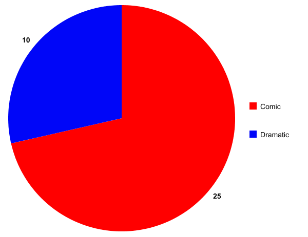
The chart shows that out of the 35 people asked, only 10 preferred straight drama to a film with comic elements. This supports the intended use of comedy in my own film, although it would seem to make sense to give it some dramatic appeal to attract both sides of the divide. This may be achievable by not relying on slapstick alone, but adding a plot twist or some other creative or narrative device to my film.
5. In a short, do you prefer to see fast paced cutting, with many different shots in a short amount of time, or a slower paced affair with more thinking time?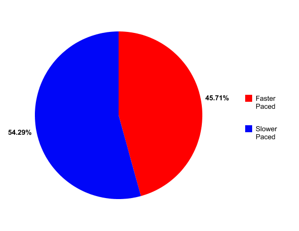
As the chart shows, my audience's preference to editing style is somewhat split, with almost 50% preferring fast paced cuts and 50% preferring slow. It would be beneficial, therefore, to include both in my film, where appropriate.
6. Do you believe dialogue to be a necessary feature in short films, especially in terms of a narrative?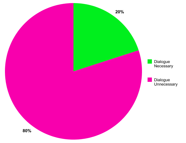
The chart shows that my target audience are, for the most part, not concerned whether a film contains dialogue or not. This information supports my decision to not use any dialogue within my own short film.
7. Do you enjoy music illustrative of the events on screen in shorts, no music, or merely incidental music that is separate to the events on screen?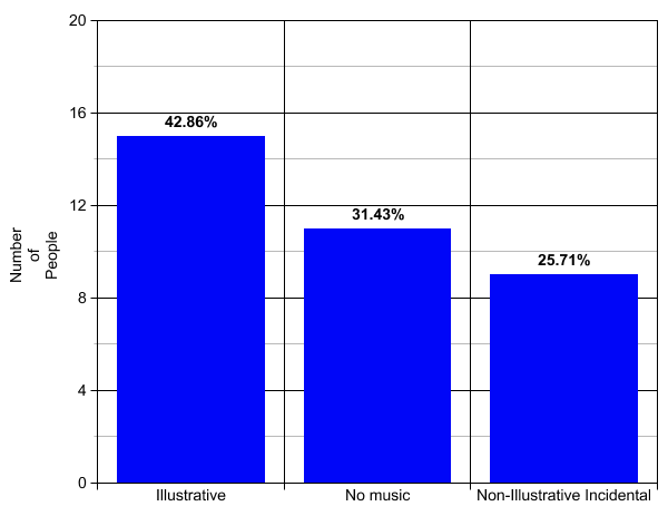
The results, when plotted into a bar chart, show that my audience's opinion on the role of music in a film is somewhat split. The chart shows that while the majority enjoy illustrative music, it is not an overwhelming majority. What is shown is that my audience tends to prefer illustrative or no music at all as opposed to mere background music, with only 25.71% enjoying non-illustrative background music. I'll try to use a mix of illustrative music and silence for effect in my film.
8. Do you prefer film credits to be displayed at the opening of the film, only at the end or does it not affect you either way?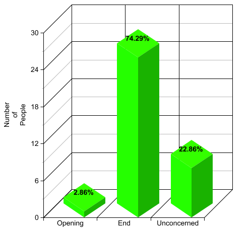
An overwhelming majority of my audience prefer credits to be shown only at the end of a film (74.29%). This further solidifies my decision not to have opening credits of any sort.
I created this questionnaire to be handed out to friends, acquaintances and family members in order to gain insight into what my audience expects to see from a short film.
My target audience is broad, and my film is supposed to have a wide appeal, so I made sure my questionnaire was answered by people of different ages and genders.
1. What age category do you fall into?
14 or under/15-19/20-29/30-39/40-49/50+
2. Would you consider yourself a fan of the film medium?
Yes/No
3. Do you enjoy short films when they are aired before features in cinemas (for example the Pixar shorts)?
Yes/No/Sometimes
4. Do you prefer when films, specifically short films, have a comic element to them, or do you prefer serious drama?
Comic/Dramatic
5. In a short, do you prefer to see fast paced cutting, with many different shots in a short amount of time, or a slower paced affair with more thinking time?
Fast Paced/Slower Paced
6. Do you believe dialogue to be a necessary feature in short films, especially in terms of a narrative?
Dialogue Necessary/Dialogue Unnecessary
7. Do you enjoy music illustrative of the events on screen in shorts, no music, or merely incidental music that is separate to the events on screen?
Illustrative/No Music/Non-Illustrative Incidental
8. Do you prefer film credits to be displayed at the opening of the film, the end or does it not affect you either way?
Opening/End/Unconcerned
'Wrong side of the bed' is a very short film by Daniel Lucchesi. It's running length is only about one minute, making it at the very extreme short end of the short film category. It, however, contains much appropriate to my own film, such as light physical comic elements, the theme of getting up and no dialogue.
The film contains no opening credits, much the same as 'The girl on the wall', and probably for the same reasons. The film is so short that opening credits would eat into much of the films running time, distracting viewer from the content of the film itself, and harm some of the simple aesthetic quality. Instead the title of the film is overlaid the opening shot of a man asleep in his bed. The title us in a very small, simple font in the lower third of the shot, and are in white to contrast with the dark background. This causes the title to be prominent, but not detract from the image below it.
The films twist is that it then splits into two almost identical mirrored shots of the same locations and characters, but with events playing out slightly different in each side of the screen. For example, the version main character on the left simply turns the alarm clock off when it starts ringing, while the version on the right manages to break it. This theme of good luck contrasting directly with bad luck is portrayed well by the separation of the screen to create alternate realities. This idea is played even more with later, when the two realities coinciding with one another, culminating in the two main characters switching sides, but with the 'lucky' character still remaining such.
Apart from this split screen display of the two identical worlds and characters the shots used are relatively simple, with a mix of medium shots and long shots taking up the majority of the film, showing the characters movement and expressions clearly. Close-ups are used to clearly display certain aspects of the characters luck, such as the alarm clock breaking and toast burning for the unlucky version of the main character. The shots are matched on either side of the picture, maintaining the impression that these are in fact the same people, areas and events, just under slightly different circumstances.
The use of natural lighting works well in the film, emphasising the normality of the characters and settings. Once again, the lighting is identical in either side of the picture, further showing that these are different versions of the same world and events.
'Empire' is a very popular film magazine in the U.K, providing various articles about films including previews, reviews, special large features and interviews. For the purpose of finding information on how to construct my own film review, I shall deconstruct the review of the Spanish film 'Biutiful' from the February 2011 issue of 'Empire'.
'Biutiful' is a foreign film, and so only gets half a page dedicated to it's review. Flicking through the issue, it is apparent that the large blockbusters get a two-page spread, and most other mainstream films get a single page. As a short film by an unheard of director and no big name actors, it is likely that the most space my film would have dedicated to it is a half-page, hence my reason for choosing this particular review to analyse.
The title of the film is displayed in large, blue/green font in the top left hand corner of the review. It is the larges and boldest text on the page, making it very clear to readers exactly which film is being reviewed, so it is easy for those looking for a specific film to find. The title indents on to a central image, which is a still taken from the film, and the largest object in the review, immediately drawing a viewers attention. It is appropriate therefore that the main actors are displayed in this image (and are in every review in the magazine), as they are usually the films biggest draw.
Directly under the film title is a tag line for the review, the example in this review being 'Inarritu's latest packs a dark, emotional punch'. This line is displayed in large italics, drawing attention to it, and is bound to appeal to the target audience of the film being reviewed, and mainly fans of the director. Looking briefly through other reviews in the issue, this tag-line rarely does not feature a name, whether it be the director or lead actor, further proving it to be a draw for the target audience of the film.
The text of the review is then split into four columns, providing it with a clean look by breaking up the text, and making it look more manageable and easy to read. The first column mainly consists of specific details of the film such as release date, age certificate, director, cast, running time and a short synopsis of the first part of the plot. These are displayed via subheadings in the same bold colourful text as main title, albeit much smaller, clearly defining what information is going to be given and where. The information itself is displayed alongside and below the subheadings, and is once again in italics, but much smaller than the tagline. This provides the review with aesthetic consistency, making it easy to read and pleasing to look at.
The first line of the review proper is in bold, and is slightly bigger than the rest of the review, making it clear where it begins and separating it from the rest of the detail on the page. The language used throughout quite simple but flows smoothly. The simplicity is most likely a device for mass appeal and ease of reading.
The name of the review is printed at the end of the review, in bold italics. Although this doesn't really add to either the content of the review or the visual design, it allows the writer to put their stamp on the review, and may appeal to people who are very specific about whose reviews they like.
A small paragraph subtitled 'Verdict' in the same blue/green lettering and size as the earlier subtitles is displayed beneath the main review, containing a summary of the review and a star rating out of five. The text of this summary is in bold, cleanly separating it from the main review, and the stars are slightly larger than the text. The boldness of the text and the largeness of the stars instantly draw a viewers attention to this part of the page, which immediately allows the reader to see whether the review of the film is a positive one or not, without them having to read the entire review. This adds to the ease of reading, specifically of gaining insight into the quality of each film.
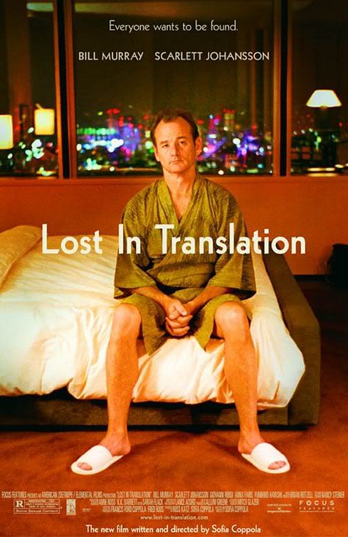
'Lost in Translation' is a 2003 drama/comedy film written and directed by Sophia Coppola. It won numerous awards, and it's realistic comedy combined with it's sense of thoughtfulness in direction and warm, high contrast visuals are elements which I will be using in my own film. 'Lost in Translation' also contains realistic, 'normal' characters in an unusual situation, a key theme in my own film.
The poster for 'Lost in Translation' maintains the clean, warm aesthetic of the film, with a brownish tint and a high contrast ratio. The poster simply shows a large picture of Bill Murray (as main character 'Bob Harris') sitting on the end of a bed with his hands clasped together. The fact that he has his hands clasped together, along with the bemused look on the characters face as he gazes vaguely into the camera betray a sense of discomfort or unrest, as if the character is unsure exactly what to do with himself. We also see that he is sat in a bland, clear room, but with a bright large city behind him. This creates a potent sense of isolation; the warm, clean hues of the room contrasting heavily with the bright neon lights of the cityscape in the background. When these elements are combined with the simple title, 'Lost in Translation', which is displayed prominently at the center of the screen in a straight, white font, it is easy to understand that the character feels lost and isolated, presumably in a foreign city. This evokes an emotional response, even before any real details of the film are revealed. The need of emotional understanding and sympathy shows the target audience to be a mature one, most likely over 16 and mostly female.
The themes of emotion are further accentuated by the films tagline, displayed at the very top of the poster, reading 'everybody wants to be found'. This, once again, will evoke an emotional response from viewers, and will attract the target audience to the film. Directly under the tagline, in the same clean font but slightly larger are the names of the two lead actors. This will attract fans of both the lead actors, and broaden the target audience, especially considering Bill Murray's film history being more catered to a male audience, with films such as 'Ghostbusters'. The larger font shows the actors to be a main draw to the film. Interestingly, the next largest name displayed on the poster is at the very bottom, and is that of the writer/director Sophia Coppola. This will mean that the poster will appeal to Sophia Coppola's work, but also shows that her name is perhaps not as a big marketing draw as the star actors.
Much like nearly all other movie posters, the bulk of the film credits are in a tiny font near the very bottom of the page, showing them to be mostly unimportant in terms of marketing strategy.
All filming will take place in and around my own home.
This is suitable to my film, as it has plenty of bedrooms (on either side, useful if I need the sun to be in a certain place for lighting purposes) and all the other rooms you would expect from a typical house. It is in an area of countryside, and also next to the sea, making it an ideal location to track the movement of the sun from for my time-lapsed sequences. It also cuts down on travel time and expenses, making it a very efficient location for filming, and I do not need any permission to film here.
All I will need to film here is a camera and a tripod, of which I have my own. the camera is battery operated, negating the risk of wires causing me to trip.
The house has a plentiful supply of electricity, for if I need to charge the camera battery, and is an ideal place to work over extended periods of time, since I have access to plenty of food and water while there.
The house is empty through the day, providing me with ideal filming conditions without any worries of being interrupted or indeed, interrupting others.
As I am not using the sound track from the recording, I do not need to worry about sound interference, and since I am the only person working on my film I do not need to worry about making sure other group members have access to the building.
Taking everything into account, the final idea for my film is to have a light comedy about a young man struggling to wake up and get up. It's focus will be on physical comedy and illustrative music, with time lapsed sequences of the sun cut between the narrative segments to show the passing of time as the main character blunders his way through the waking process.
I will film and edit the short before creating the music, to make sure it fits the narrative perfectly, and accentuates the humour. I will use natural lighting and perhaps edit the film to have slightly more colour depth. Combined with the use of held shots and the music element, hopefully this will give the film an artistic feel, instead of pure physical slapstick. My aim is to create a healthy balance of precision film-making and light humour.
Here, I will list the limitations of my current situation, and my solution to each in turn.
1. Traveling severely affects my health - I will create a film that can be set in and around my own house.
2. I have limited access to other people - I will only use a single character in my film, to be played by myself.
3. I am limited in my equipment and software, meaning if I try to use too many special effects, it will most likely look cheap and amateurish - I will rely mostly on creative camerawork rather than special effects, and try to erase the need for much hi-end equipment by using the tools that I do have available to their fullest.
4. Sound quality will be poor, since I have no mics - I will replace the audio track with music created by me especially for the film, and also concentrate on physical comedy which does not need dialogue or diegetic sound. The music I create will be tailored especially to fit what is happening on screen, partly inspired by silent movies. I have recording equipment for my piano.
My initial idea was to create a sci-fi short film based around a world in which everyone aged backwards, being born from the grave and eventually ending life in the womb. This would be a world for the people deemed not pure enough for heaven, but not impure enough for hell, my own version of limbo. I planned to make use of many extras from all ages, many locations, and extensive use of green screening and animation.
Eventually I realised, especially due to limitations of my health and the fact that I am working alone, that this idea was far too ambitious. It was not focused and concise enough to produce the quality of film I would like to create, and would have caused many problems with development, including:
1.Problems with filming children (need for extensive consent for each minor used)
2.Problems with filming in or recreations of certain environments (graveyards, hospitals and schools)
3.Technical limitations (green screening and animation will have most likely ended up looking cheap and amateurish due to not having access to high quality devices)
4. Problems recruiting enough extras and organising shoots in which everyone is available.
After considering these problems, I decided it would be best to scrap this idea, and chose something better suited to the resources I have available, and the limitations that my current health situation provides me with.
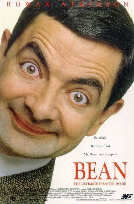
Rowan Atkinson's brand of mute, but overly emphasized physical comedy is a huge inspiration for my own film, and so it is logical that the first film poster I should look at is from the first Bean movie.
The poster initially looks very simplistic in it's design, with a clean white background, and a huge close up photo of Rowan Atkinson, pulling a comical face that is typical of the Bean character. This recognises that the main draw of the film is Rowan Atkinson's comic character, and so displaying an image of the character so prominently will be sure to attract attention to the poster. The simple and clean design is also pleasant to look at, preventing itself from using any offensively loud design elements. The white background provides a high contrast to the image of Rowan Atkinson, furthering it's prominence.
At further inspection, it is clear to see that the largest word displayed on the poster is 'Bean' followed by 'Rowan Atkinson', once again showing the films biggest selling point to be it's main character. Displayed slightly above the title of the film is the film's tag lines. Due to the fact that these are placed directly upon the white background, and are in black lettering with a medium sized font, this is likely to be the first thing a viewer will read upon a closer look at the poster. Indeed, the only other detail on the poster are the film credits, placed at the very bottom of the poster in a tiny font. The tag hints at the plot of the film without giving much away, stimulating the imagination of the viewer, especially of those which are familiar with the character, whom one can assume are the target audience of the film.
Overall, the lettering placement and font sizes, combined with the huge image of Bean and not much else, create a very clean and classy look while still maintaining comic elements and appealing to the target audience - successes I would very much like to emulate in my own film poster.
'The girl on the wall' is a Greek short film, created by amateur director, writer and producer Gabriel Psaltakis. It was found upon a browse through short films on youtube, and I feel that it is suitable for analysis due to it's genre coinciding with the genre I have chosen (comedy) while still maintaining artistic direction. The film also deals with ordinary people and settings (verging on mundanity) but with extraordinary events, which is something I wish to do in my own film.
Immediately notable is the lack of opening credits. As short films are usually a focused work of creative art, I can assume this is because opening credits are needlessly intrusive, and could probably end up taking up a large portion of the video, distracting the viewer from the carefully crafted content. Instead, the title is briefly overlaid a short montage of a young man eating breakfast. A medium shot is used to show the tired expression on the man's face as he sits at a table, and a series of close ups showing milk being poured and the bowl of cereal illustrate the act of making breakfast, without taking up needless amounts of time.
Throughout the film, straight cuts are used abundantly, presumably to keep the flow. However, intermittently, more elaborate transitions are used. These include fades and variants thereof, and are usually used to show the more significant changes in environment or time. For example, the video changes from taking place through the day to the evening (signified by low lighting, or perhaps simply a filter on the camera) through the use of a circle fade. This type of transition manipulation very effectively creates natural breaks in the film, making the change of location or time seem more natural, without breaking the flow of the film.
Animation is used prominently in the film, through a couple of graffiti characters. It is assumable that these were animated through the use of digital animation, and then super imposed upon the walls they appear on in the film through editing. They add vibrancy and colour to an otherwise quite bland colour palette, perhaps to signify the similar impact they seem to have on the main characters life, who seems to work a mundane 9 to 5 office job, illustrated by his tie, glasses and briefcase, and also his initial distaste for the graffiti artist. The developing relationship between the main character and the animated graffiti man is shown through a montage of wide shots, showing them talking, with the main character constantly changing position in the shot, signifying that this was not one, but many conversations that took place between them. This helps to develop the plot at a rapid pace, but does make it lose some depth. Fortunately, depth of the characters isn't really what the film is about, further accentuated by the very sparse use of dialogue.
The films use of natural lighting, and the fact that is mostly takes place through the day, give it a light airy feeling, emphasizing the fact that it's a light comedy. The vibrancy of the graffiti characters also adds to this effect, along with the bright and bouncy non-diegetic music.
I made this list to help me plan out my completion objectives for each day, the time estimates are quite optimistic, and in reality I'll allow myself more than that amount of time to complete each piece.
1. Explore the construction of a short film through a short essay – 30 min
2. Repeat with a different short film (try and keep appropriate to genre) – 30 min
3. Deconstruct a film poster (comedy). (x2) – 30 min
4. Deconstruct a magazine review. (x2) – 30 min
5. Genre research – questionnaire – 30 min
6. Genre research – results – 1 Hour
7. Initial ideas. – 30 min
8. Call sheet. (Including props and locations) – 1 Hour
9. Pitch/Treatment sheet. – 1 Hour
10. Location Recce. – 30 min
11. Storyboard (Animatic) – 3 Hours
12. Risk Assessment. – 30 min
13. Shooting Schedule. – 15 min
14. Making of the Film poster (with screen grabs) – 2 hours
15. Making of the magazine review (with screen grabs) – 2 hours
16. Shoot the film – 3 Hours
17. Edit film (including making the music) – 6 Hours
18. Evaluation – 3 Hours
Total – 27 hours and 15 minutes.
© All Rights Reserved. Matthew Leigh G324 Advanced Portfolio | Theme by : Hosting Reviews | Converted into Blogger Templates by Theme Craft
