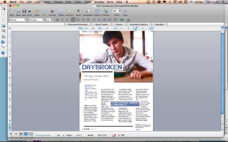
Magazine Review Construction
Posted by Matthew Leigh | Posted in Ancillary Task Construction | Posted on
0
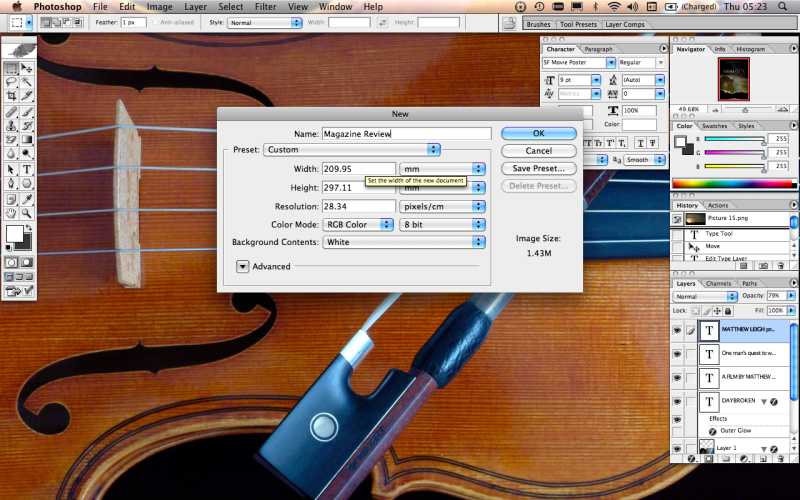
The first step was to create a photoshop project in the correct dimensions for my magazine page.
Next I added the image I wished to use for my review.
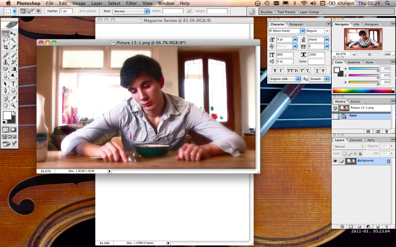
I placed the image onto my background.
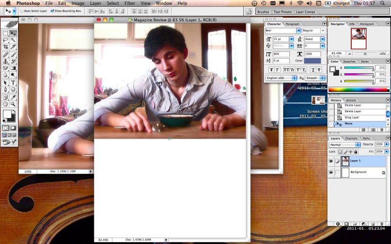
The next step was to create a few text boxes over the top of the image layer, and entering the title text, page title text and subtitle/tag line.
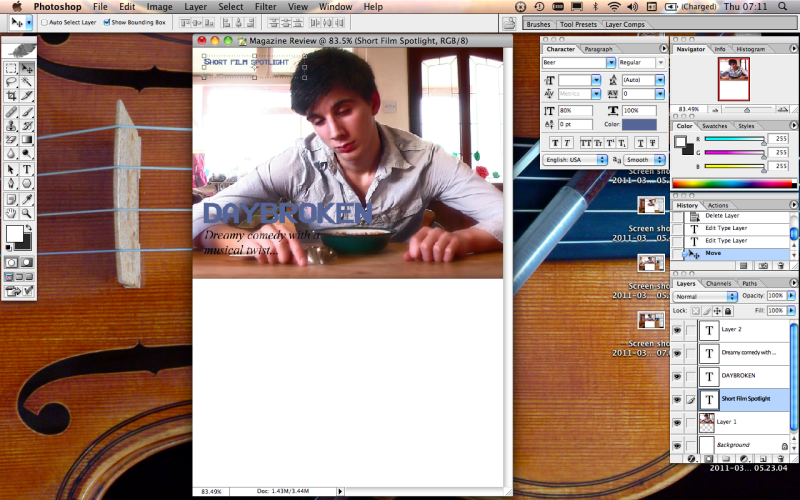
To make the text clearer, I added plain white backgrounds underneath the title and subtitle text.
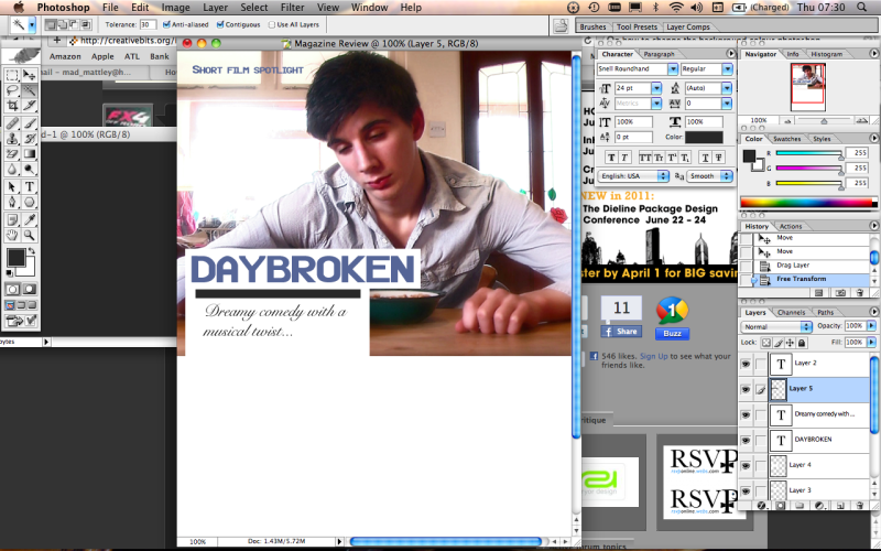
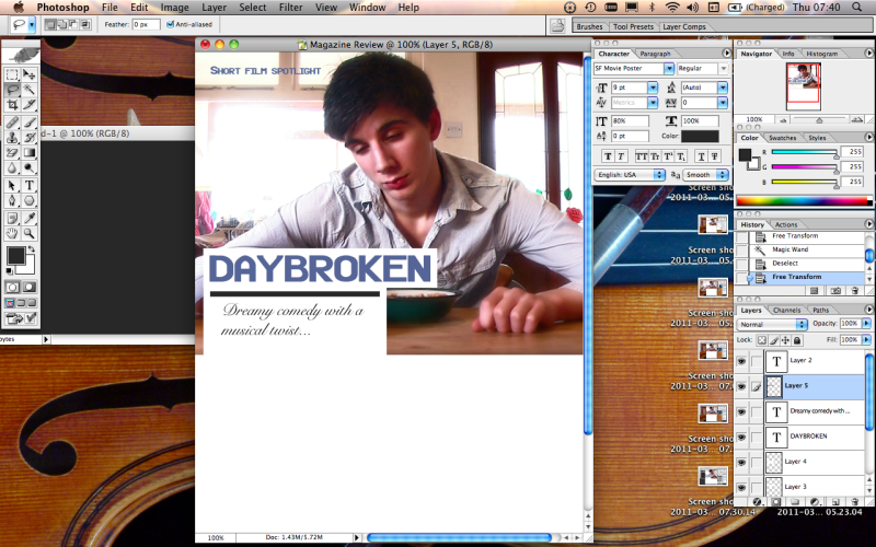
The use of a simple black bar helped to separate the text, making it easier to read.
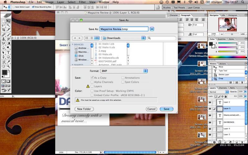
I then saved the image as a bitmap file, in order to transfer it over to word, where I worked the written portion of the article.
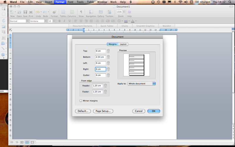
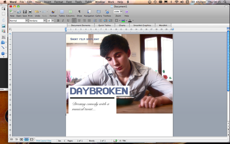
Opening a word document, I went straight to the format settings to remove the page borders, so my image could fill the page.
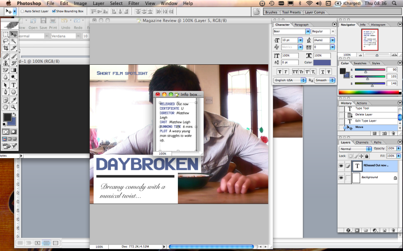
I moved back into photoshop to make an info box, containing key information about the film. I did this using a text box and a plain background.
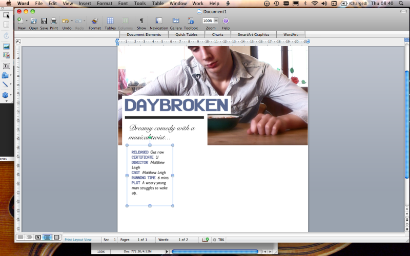
I inserted this box into the word document, changing the text wrapping to tight in order for it to be moved freely around the page.
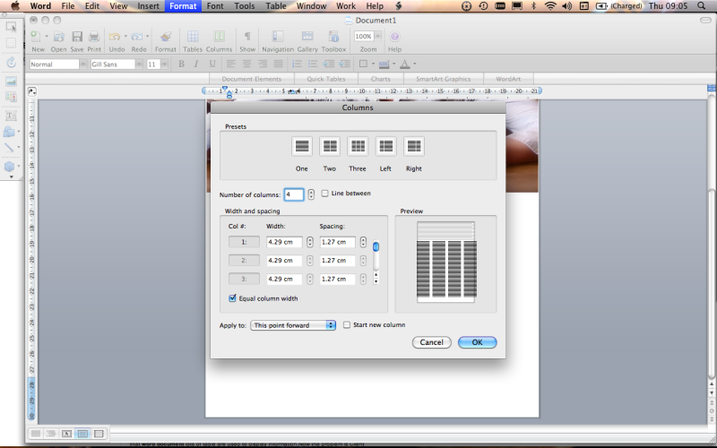
I used the format options to divide my document into four columns, in preparation for the bulk of text.
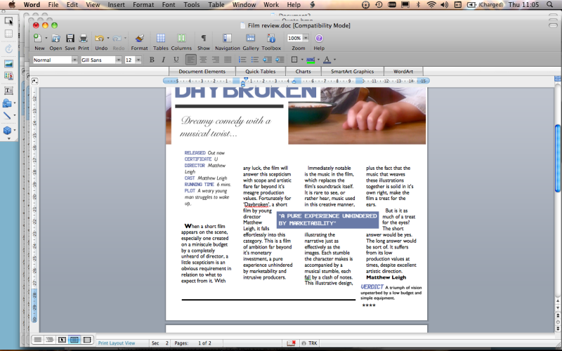
Once again using photoshop, I created a quote from the review in a coloured box and also a Verdict box, giving a brief summary of the review and a star rating. I applied tight text wrapping to the quote, and placed in in amongst the text of the review.
Finally, I placed the page number, magazine title and date into the footer of the page.
