Evaluation Question 4
Posted by Matthew Leigh | Posted in Evaluation | Posted on
0
Please use the full screen option, accessed through the 'more' icon on the bottom right corner of the control bar, otherwise text will be hard to read!
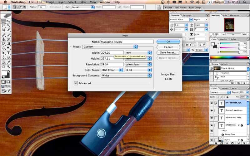
The first step was to create a photoshop project in the correct dimensions for my magazine page.
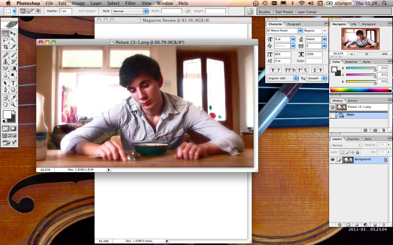
Next I added the image I wished to use for my review.
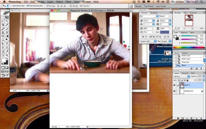
I placed the image onto my background.
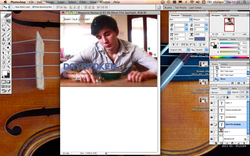
The next step was to create a few text boxes over the top of the image layer, and entering the title text, page title text and subtitle/tag line.
To make the text clearer, I added plain white backgrounds underneath the title and subtitle text.
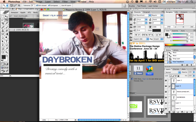
The use of a simple black bar helped to separate the text, making it easier to read.
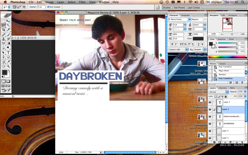
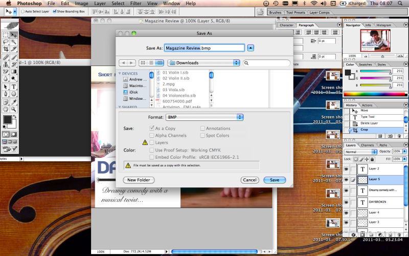
I then saved the image as a bitmap file, in order to transfer it over to word, where I worked the written portion of the article.
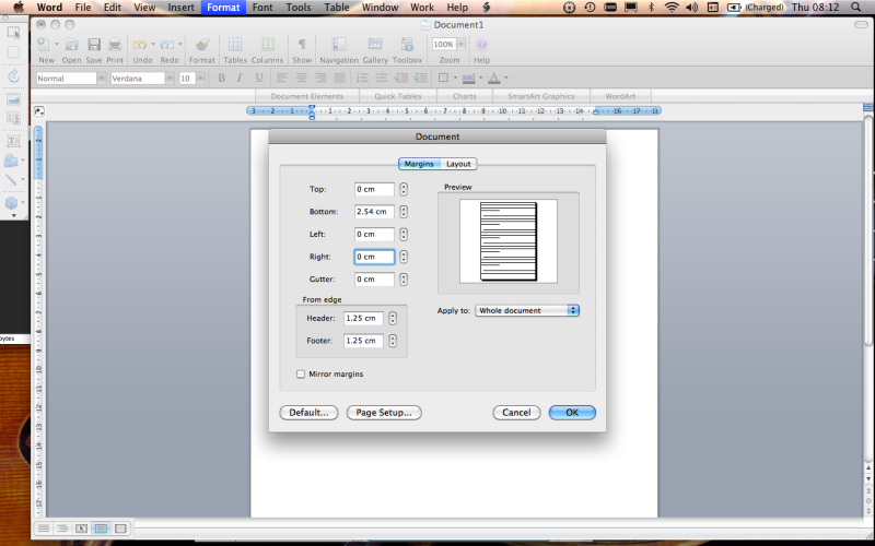
Opening a word document, I went straight to the format settings to remove the page borders, so my image could fill the page.
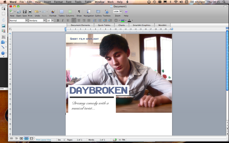
I moved back into photoshop to make an info box, containing key information about the film. I did this using a text box and a plain background.
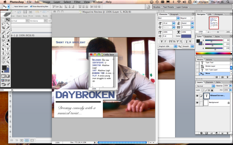
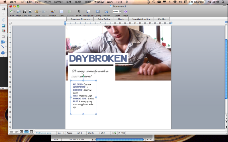
I inserted this box into the word document, changing the text wrapping to tight in order for it to be moved freely around the page.
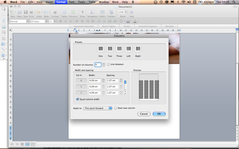
I used the format options to divide my document into four columns, in preparation for the bulk of text.
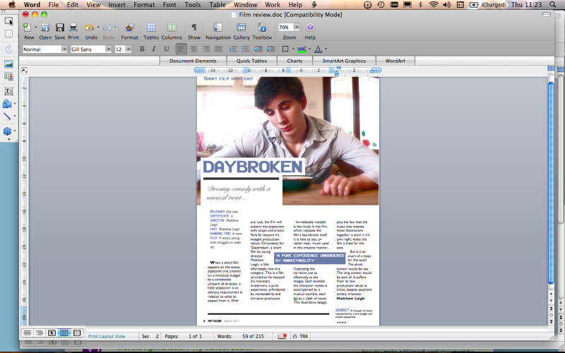
Once again using photoshop, I created a quote from the review in a coloured box and also a Verdict box, giving a brief summary of the review and a star rating. I applied tight text wrapping to the quote, and placed in in amongst the text of the review.
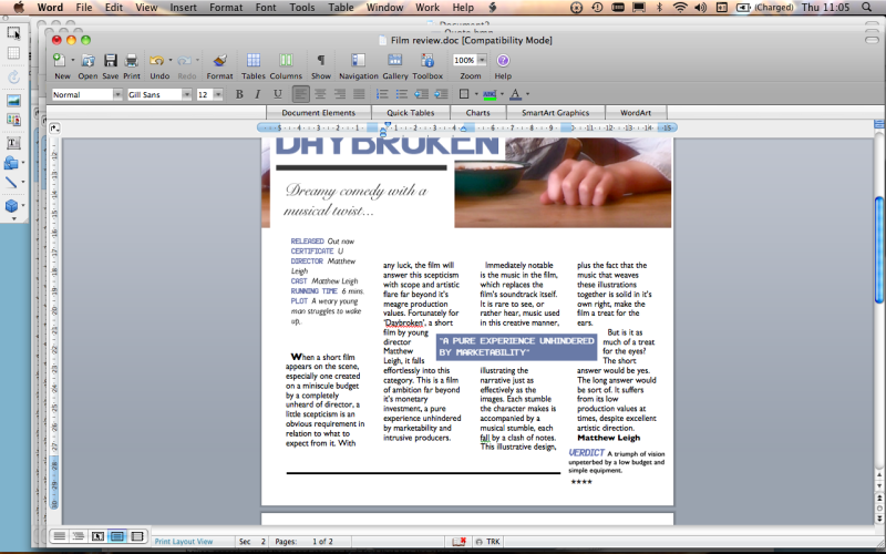
Finally, I placed the page number, magazine title and date into the footer of the page.
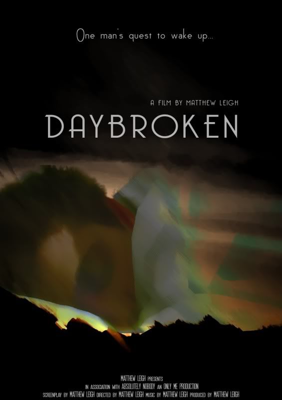
I feel that the simple, appealing aesthetic of my film poster, combined with it's prominent display of my name as the director of the film, and also the whimsical tag line (which is also displayed prominently) will cause the poster to be effective at attracting my target audience.
I started by selecting my background image, I took this from a screenshot of my film.
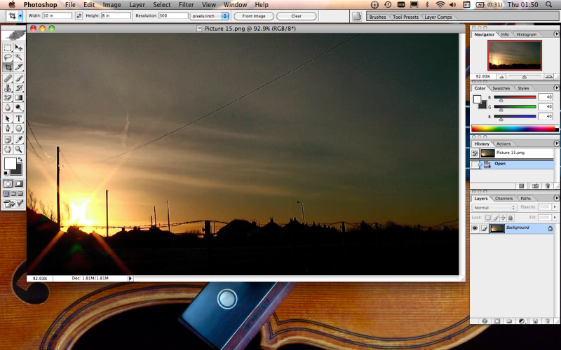
The next step was to crop the image to the correct dimensions for my poster. I did this by setting the measurements in the crop tool, and then using the crop tool to edit the image.
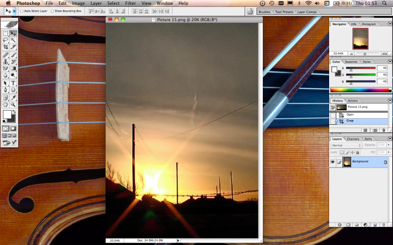
I then used the filter options to modify my background image to my liking.
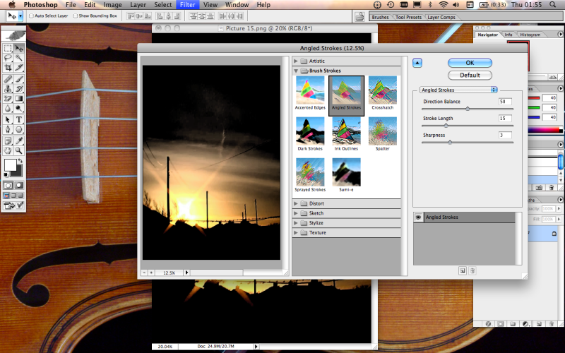
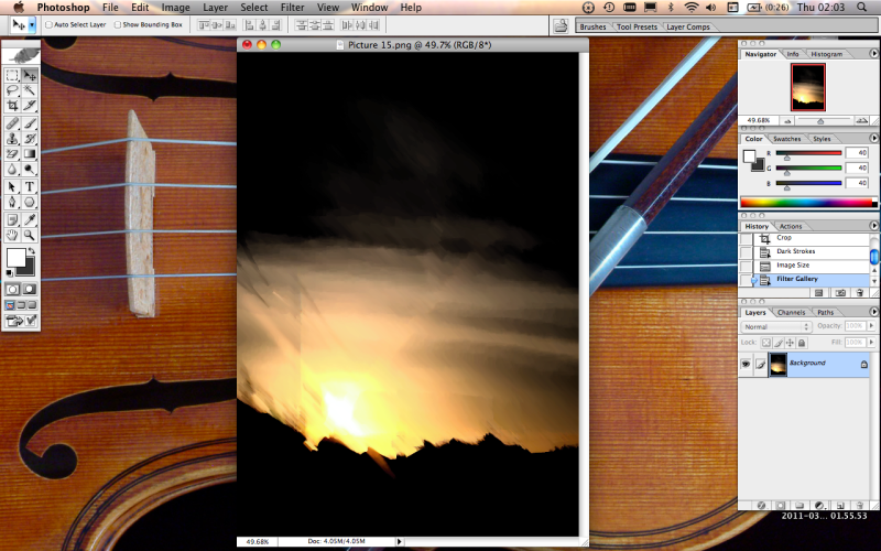
I decided on which filters to use, and modified their parameters until my background image looked like this.
I then opened another screen shot from my film to form my second layer.
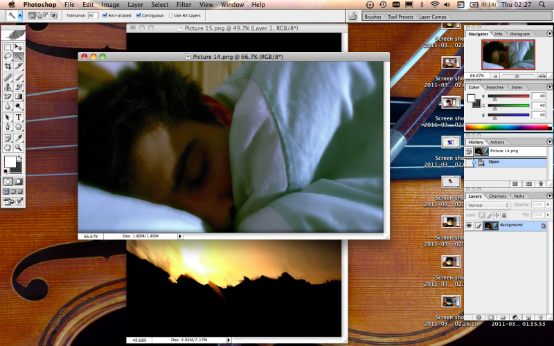
Next, I used the mark and extract tools to cut out a section of the new image's background.
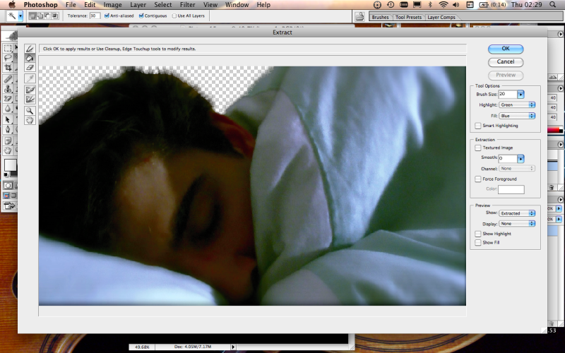
I dragged the new image onto my background.
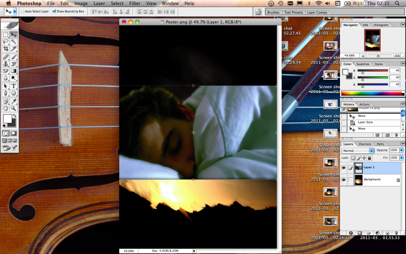
I then used the layout settings to alter the blending settings of my image, making it more transparent.
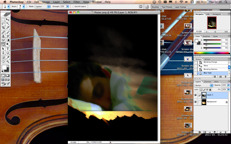
I used the dodge, blur and mover tool to tweak the image to my liking. I also added a slight shadow on the image, to help it blend smoothly with the background.
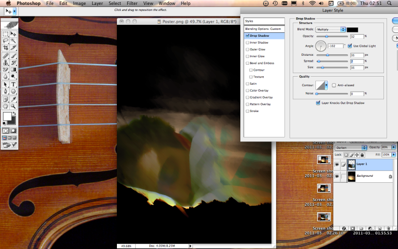
I then used the text tool to add text to my poster.
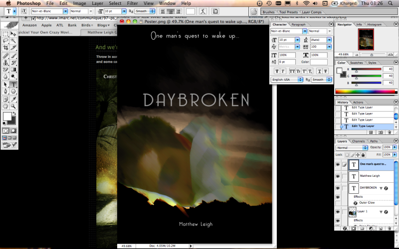
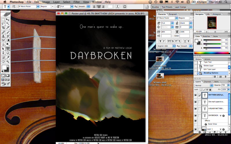
I wasn't happy with the positions of the text, and also I felt to achieve a true professional look I would have to add the small print credits to the bottom of the poster, and so I adjusted the positions of the text using the mover tool, and added the small print text, completing my poster.
There exist a couple of means to fund and distribute my short film. One such way would be through a large company who would show the film in theaters, before the feature presentation. Pixar are one such company that partake in this practice, but the shorts are always animated and are made in-house, meaning that my film would be unsuitable for Pixar's use. Instead, I could appeal to it's parent company, Disney, as they may be willing to extend this practice to it's live action features.
Perhaps the more realistic way of gaining funding for, and distributing my film to it's target audience would be through a specialist short film distributor. The biggest of these is Futureshorts. Futureshorts are a global company that specialise in the distribution of short films, holding monthly events to air new films and backing films for such awards as the BAFTAs and Academy Awards. They also distribute films to short film festivals. Futureshorts also provide a consultancy service and have their own dvd label, meaning every aspect of my films publication, marketing and distribution would be covered.
© All Rights Reserved. Matthew Leigh G324 Advanced Portfolio | Theme by : Hosting Reviews | Converted into Blogger Templates by Theme Craft
