Evaluation Question 4
Posted by Matthew Leigh | Posted in Evaluation | Posted on
0
Please use the full screen option, accessed through the 'more' icon on the bottom right corner of the control bar, otherwise text will be hard to read!
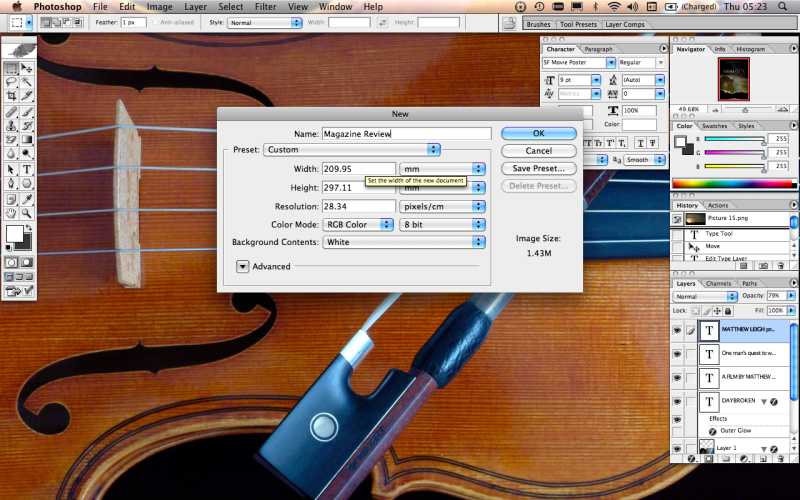
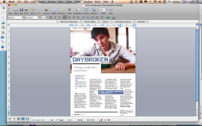
The first step was to create a photoshop project in the correct dimensions for my magazine page.
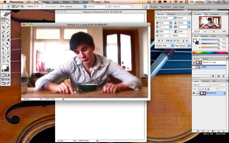
Next I added the image I wished to use for my review.
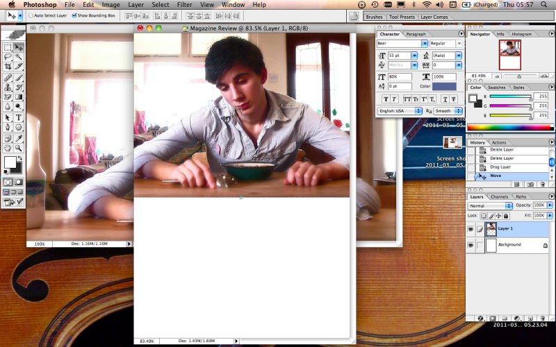
I placed the image onto my background.
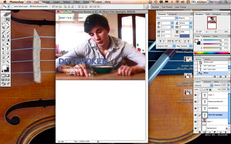
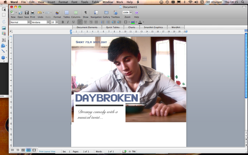
The next step was to create a few text boxes over the top of the image layer, and entering the title text, page title text and subtitle/tag line.
To make the text clearer, I added plain white backgrounds underneath the title and subtitle text.
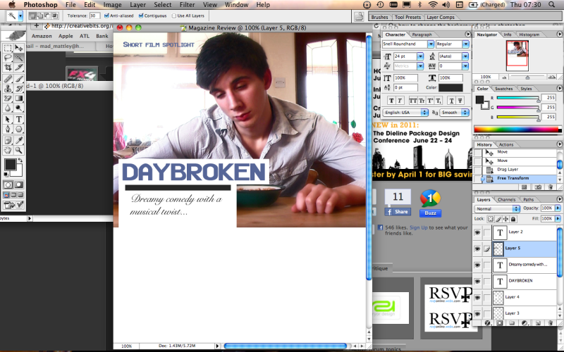
The use of a simple black bar helped to separate the text, making it easier to read.
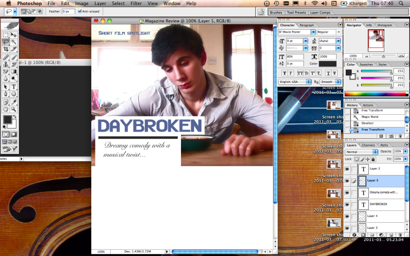
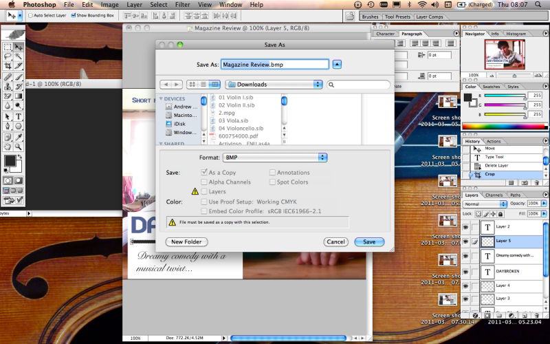
I then saved the image as a bitmap file, in order to transfer it over to word, where I worked the written portion of the article.
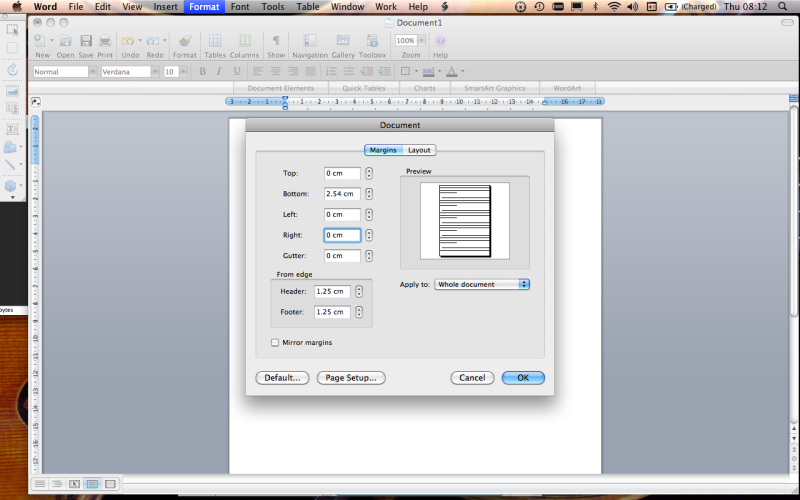
Opening a word document, I went straight to the format settings to remove the page borders, so my image could fill the page.
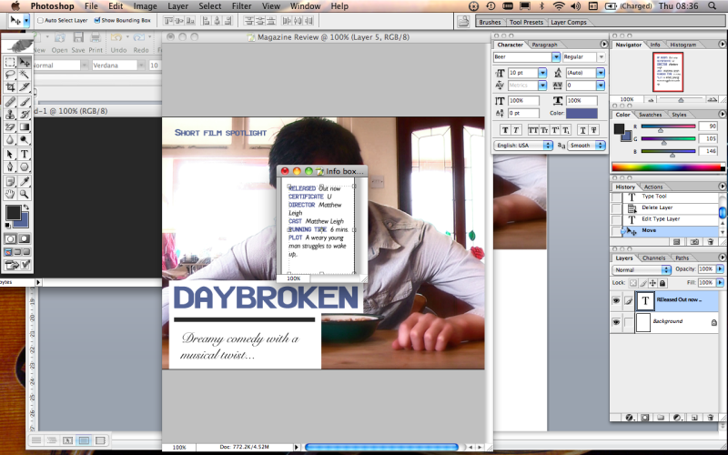
I moved back into photoshop to make an info box, containing key information about the film. I did this using a text box and a plain background.
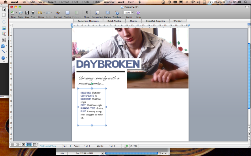
I inserted this box into the word document, changing the text wrapping to tight in order for it to be moved freely around the page.
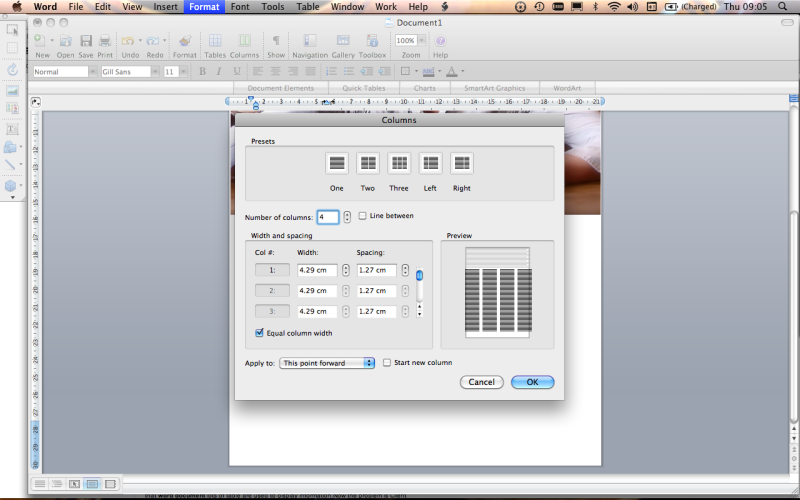
I used the format options to divide my document into four columns, in preparation for the bulk of text.
Once again using photoshop, I created a quote from the review in a coloured box and also a Verdict box, giving a brief summary of the review and a star rating. I applied tight text wrapping to the quote, and placed in in amongst the text of the review.
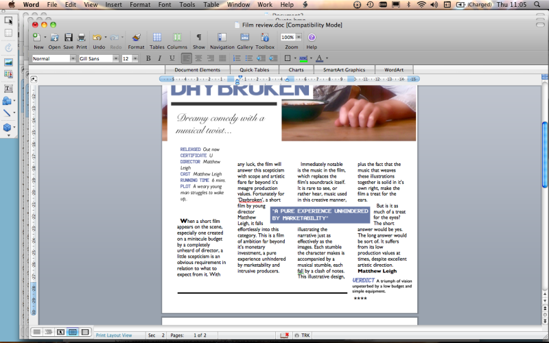
Finally, I placed the page number, magazine title and date into the footer of the page.
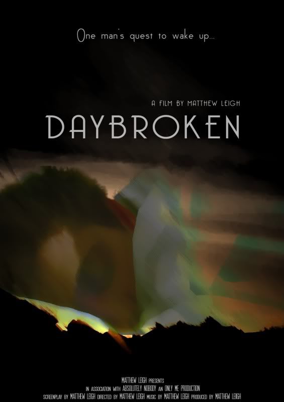
I feel that the simple, appealing aesthetic of my film poster, combined with it's prominent display of my name as the director of the film, and also the whimsical tag line (which is also displayed prominently) will cause the poster to be effective at attracting my target audience.
© All Rights Reserved. Matthew Leigh G324 Advanced Portfolio | Theme by : Hosting Reviews | Converted into Blogger Templates by Theme Craft
